-
I'm learning how to fight back. Embrace people as they are. Embrace myself as I am. It’s embarrassingly simple.

-
I turned 30 this year. Depressed, with little self-worth, I'm slowly beginning to heal; touching grass, dirt and all.
-
Stripping away from my working identity and ego has helped me connect more authentically with people. And touch more grass.
-
I’m still trying to figure out my sense of balance, identity(ies), and goals in a deeply unjust and complex world.
-
Instead of writing a deeply introspective post with a witty title, I want to learn how to chill out and enjoy life a little more.
-
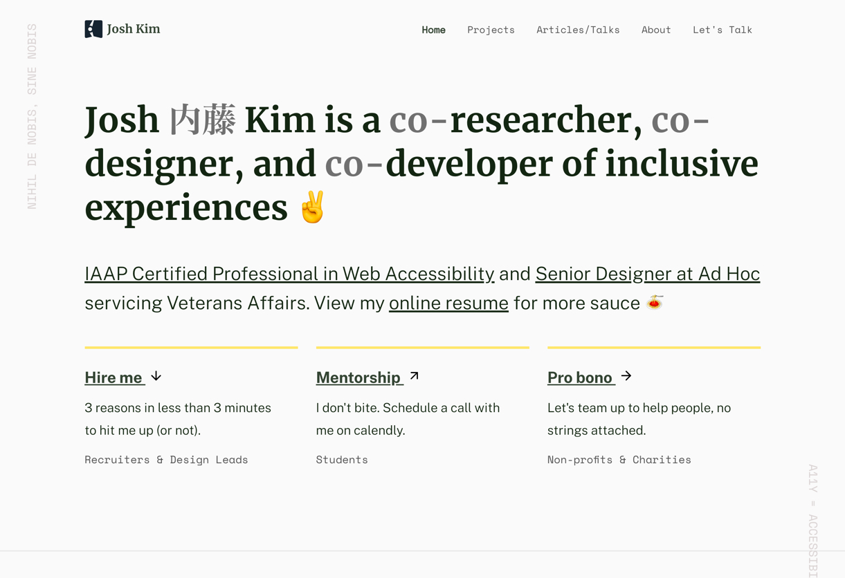
I spent alot of time thinking about how little control I have in my work. Alot of that was focused around the mediums I use.
-
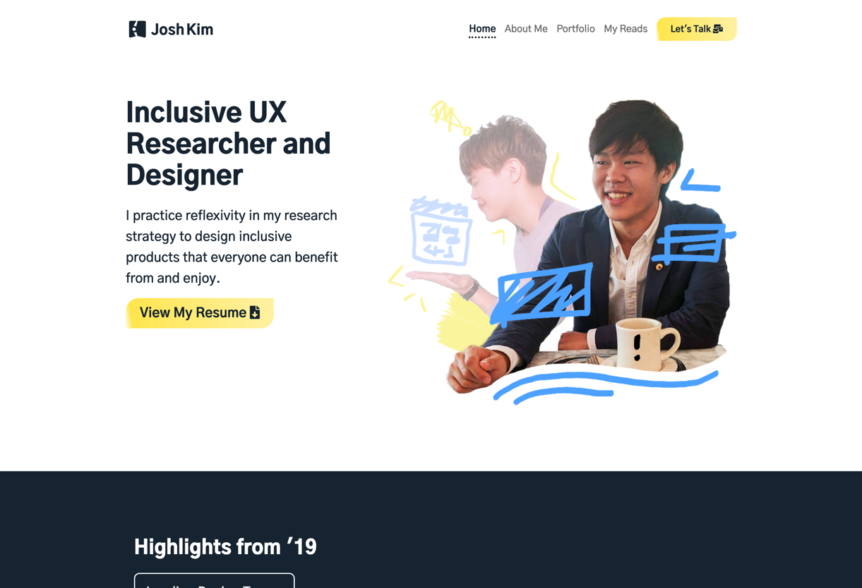
2019 popped my bubble of naive realism and projection bias. As a result, I want to create more meaningful and inclusive products.
-
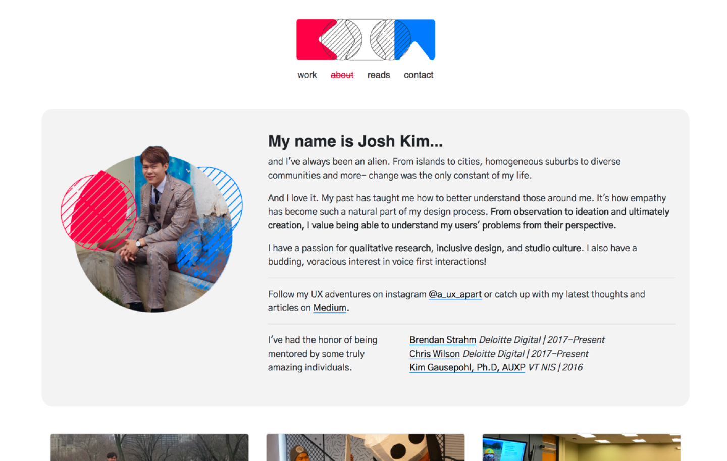
I didn’t sit down in front of my computer to muscle an update in one go. Instead, it was an iterative process.
-
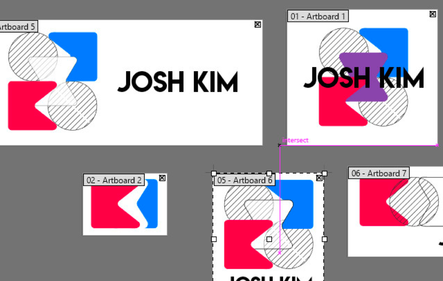
I am a UX Designer. I am not a graphic designer. I am not developer. Can I do work in both? Yes, but that’s not what I want to communicate.
-
The doubt kicked in. Maybe my website really is bad. No, sweet and innocent younger me, it sucked and it always will.
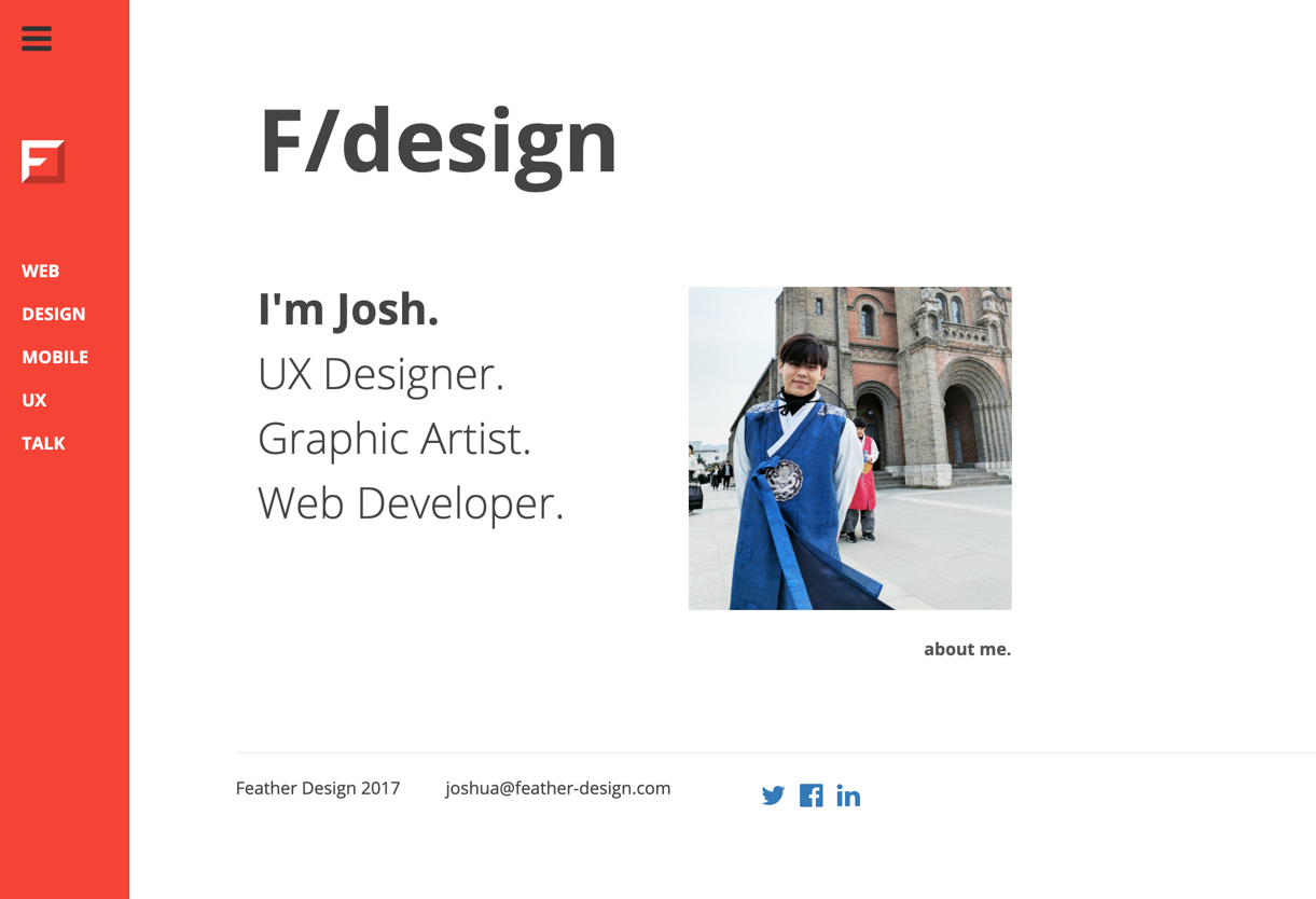
Portfolio Updates
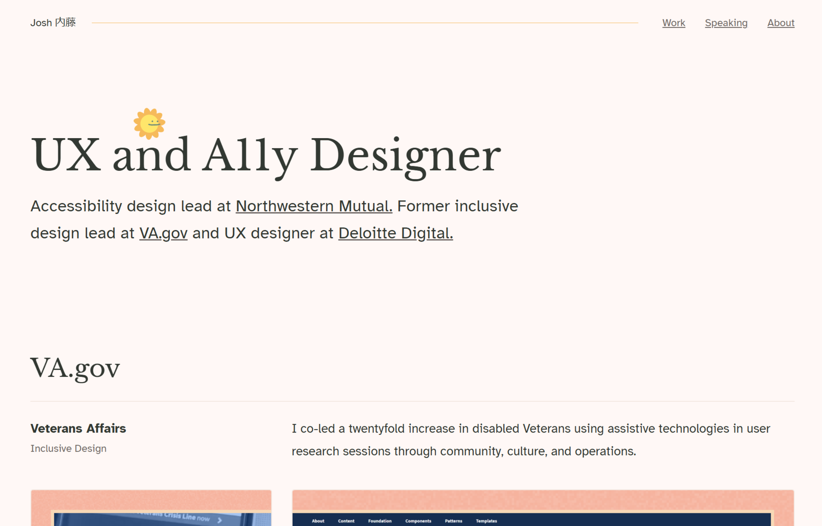
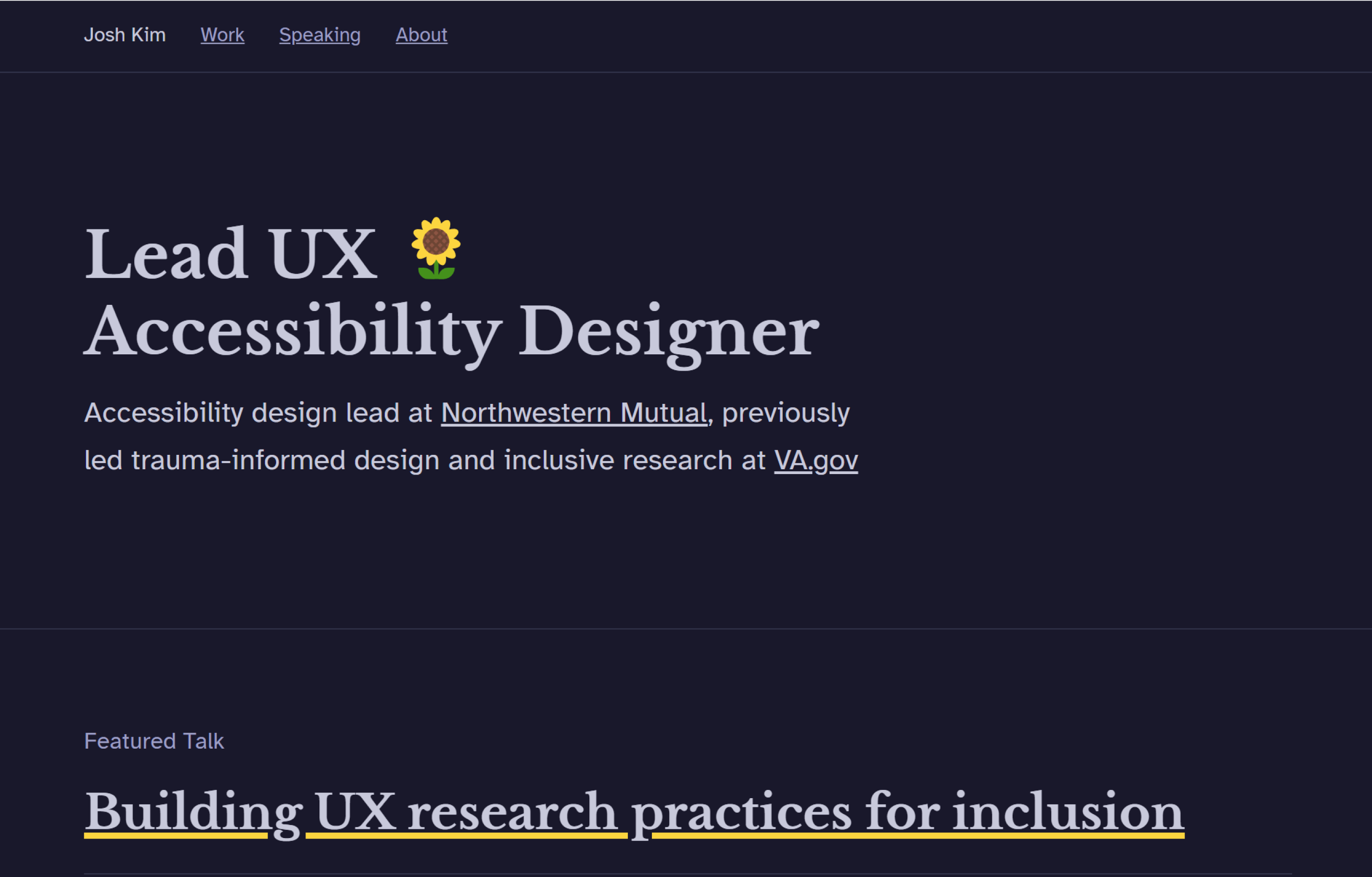
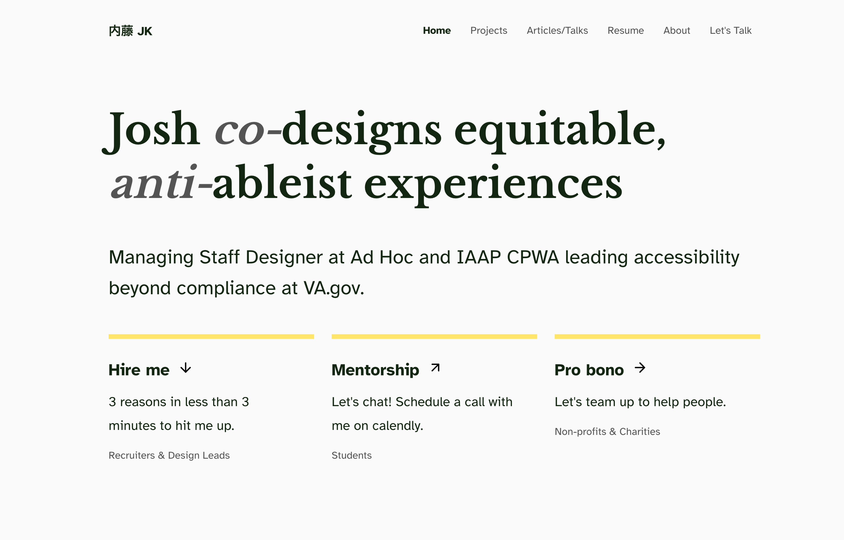
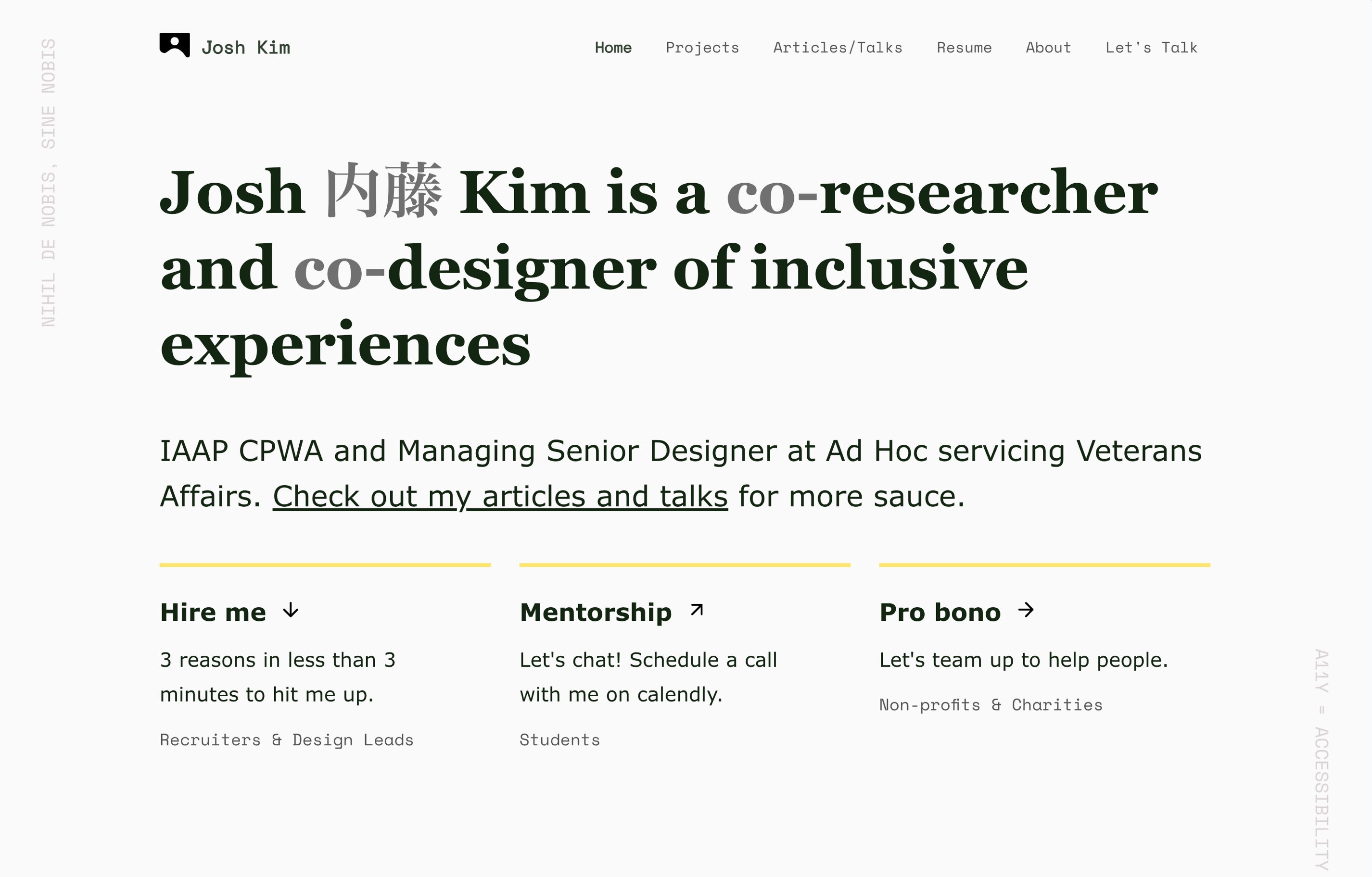
On an annual basis, I trash and rebuild this website to reflect on my growing values.